RISING ABOVE THE TREELINE

by Catarina Ferreira, AIA

During an Advisory Neighborhood Commission hearing review of a then proposed single family residence for DC’s Colonial Village neighborhood, a concerned neighbor flatly stated: “Some lots are just not buildable.” Having grown up on a volcanic island where site conditions are often much more difficult, I knew that was certainly not the case. But, in these situations, one must be diplomatic.

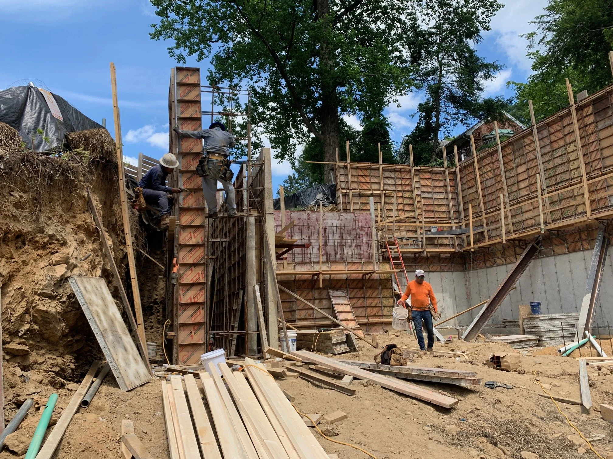
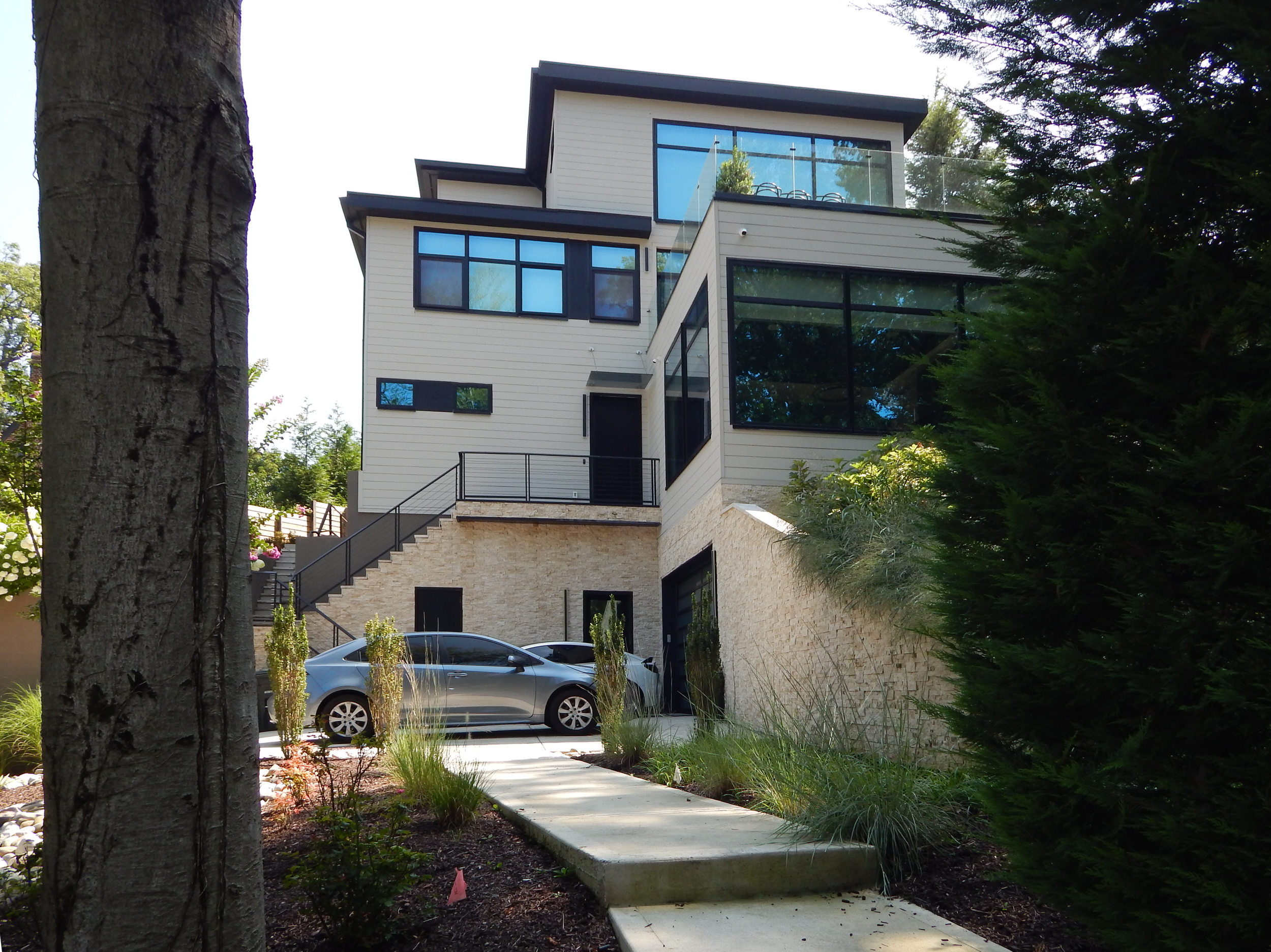
With a drop of over twenty feet from the rear to the front of the house, the lot was indeed difficult and expensive to build on.

The project is not located in a Historic District but required approval from DDOT, hence the public review process. The proposed home was very contemporary, in stark contrast with the more traditional homes throughout the neighborhood, appropriately called ‘Colonial Village.’ Some opposition was to be expected. How can a new home be contextual without deferring to being a superficial caricature of its context, as so many hearts desire?

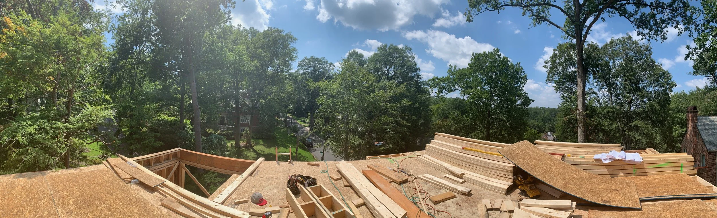
Adjacent to the newly subdivided lot, a large Tudor style home presents itself towards the intersection the front of our project frontally viewed from, as a series of volumes gradually increasing in size, stepping back gradually. Sometimes the answer lies in the problem… The site conditions forced us to break down the massing of the house into a series of volumes gradually stepping up the hill.

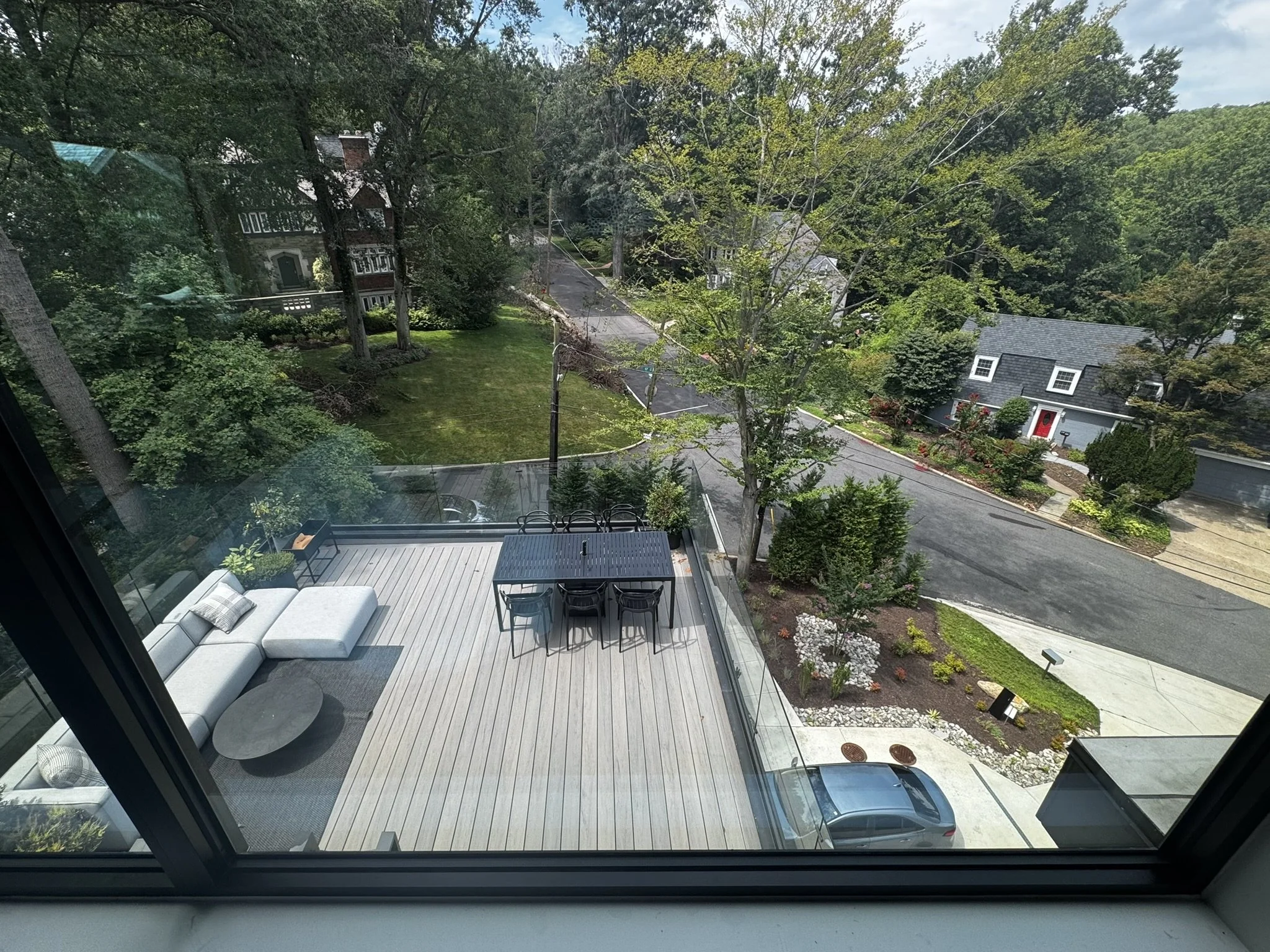
It may not seem obvious at first, but the parallel is clear upon closer look. Even the wrap-around windows on the front volume are in sync with the garden room next door, as both spaces focus on views downhill towards sunset over Rock Creek Park to the West. So is the parallel between the rusticated base on the house next door and the stone base at our project. The exterior finishes originally specified for the project were ultimately changed by our developer client (developers tend to have a mind of their own about these things). As a result, the dark wood siding closer to the brick color throughout the neighborhood at the front volume and charcoal grey siding behind it became light grey throughout, giving the house a more monolithic but perhaps more sculptural appearance.

On a recent visit to the house, while taking some photos of the exterior, a neighbor approached me and said: “I kind of like it. It’s the new Colonial.”

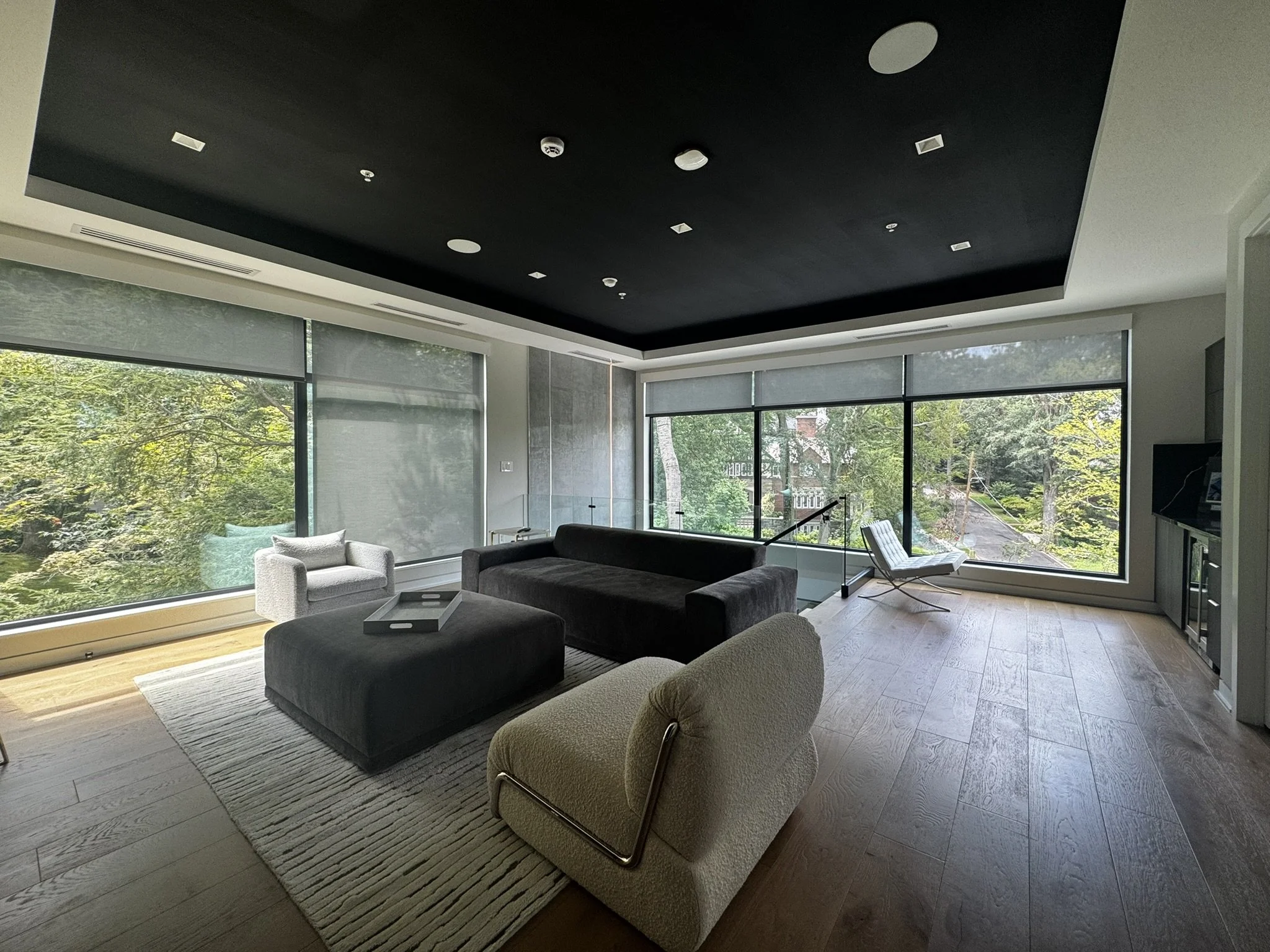
The living room steps down into the hillside, providing taller ceilings, a grander space and a literal opportunity to actively engage with the topography.

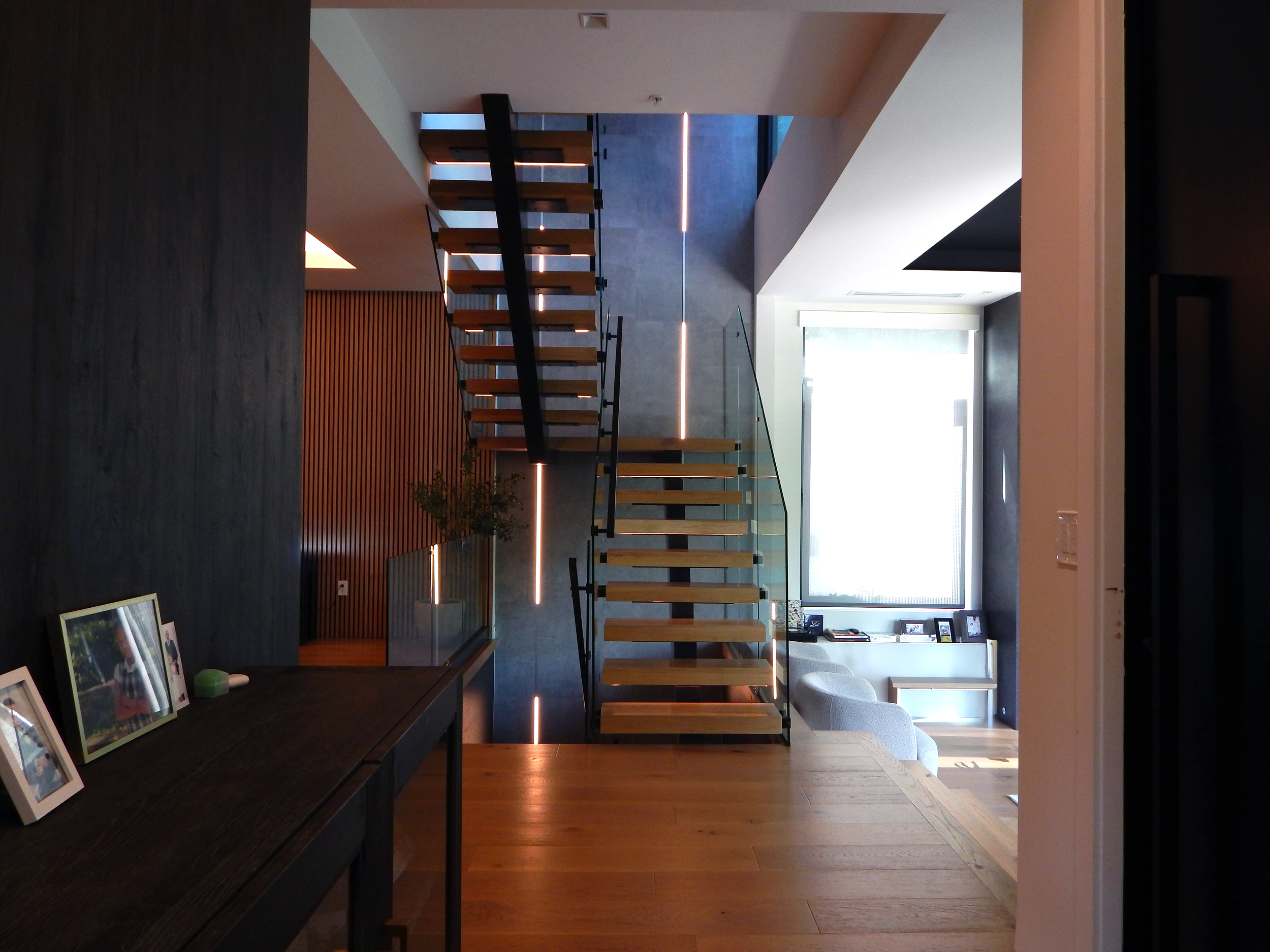
The central stair unifies the four levels of the house, while also connecting them to a large roof deck overlooking sunsets overlooking Rock Creek Park to the West.

DOUBLE VISION

by Catarina Ferreira, AIA

Construction at our mixed use building at 1400 9th St NW is finally picking up momentum. The initial phases of building facade stabilization, foundations and underpinning were technically difficult to accomplish and took several months to complete. Now, with framing nearing completion, the project is finally materializing and starting to look like a building , or is it two?

Located in the Shaw Historic District, the original building was built around 1850, making it one of the oldest (if not the oldest) contributing structures within the historic district. Vacant for decades and in poor condition, the building was nearing collapse when purchased at auction. The initial concept presented to the HPRB for review requested the demolition of the existing structure and replaced with an entirely new building. That concept was rejected, after board members visited the site and determined that the building could be salvaged. Then our job became a lot more difficult…

Typically, visible additions to existing contributing structures are not permitted. The project would not be viable without an increase in building area. Our second proposal to the HPRB, which underwent a smooth review process and was quickly approved, consisted of additions/alterations to the existing building, including a four story addition on the North side of the where a non-original structure previously existed. Conceptually, it made total sense. From a design stand-point, it seemed like an impossible mission. How could we create a coherent whole out of two such different parts? To complicate matters even more, the building occupies a corner site, making an alterations proposed very prominent. It also has no preferred orientation, and it seems that has always been the case. Is 9th St the front of is O St the front? It’s like it’s trying to be two buildings at once.

Sometimes the problem becomes the solution.

The European in me would have sought a clear distinction between old and new, so that was the starting point. However, in this case it was not just a matter of design a new building next to the old one. The original building required a significant amount of repair work and its 9th St elevation (the actual facade based on the building’s address) lacked coherence. Several poorly-designed alterations had been made over the last 170 years or so.

Sometimes the answer is not about black vs. white but rather shades of grey. The ultimate solution is a hybrid building that blurs the line between old and new just enough to make a passer-by do a double take. It looks like one building from farther away, like two up close. This allowed the integrity of the historic structure to be maintained, allowed us to propose a clean addition that is distinct yet compatible, and most importantly, one does not try to mimic/reproduce the existing building.

Often, in Washington DC, the tendency is to mimic the appearance of historic structures or to propose a slightly watered down version of them in order to try to achieve compatibility. That erasure of history, by replicating a historic language in the present, reduces the proposed and the original building to nothing more than their appearance. To me, architecture is about poetry, creating a rich experience by manipulating the grey zone, not about superficiality/appearance. Historic districts are first and foremost about a coherent atmosphere.

So how did we achieve a coherent atmosphere/ historic compatibility in this case?

  1. My number one go-to strategy in historic district is always simplicity: simple massing, discrete character.

  2. Then comes soul/personality: In this case, is it one building or two? It seemed important to maintain that duality. Also, a raw, slightly industrial aesthetic is proposed in both parts of the building. I feel this is compatible with the character of this particular historic district, where alleys are streets, carriage houses are homes, and just a dash of grit prevails.

  3. Then comes continuity of materials: same brick color/size, same siding material on bay windows, same window color, despite different geometry/size.

Now that it has taken shape, the verdict is in: it is one building, but its also two at the same time, as has always been the case. Amazingly, I think it actually works!